Assignment 5 Report
RecoAR Application
Assignment 5: Development and Evaluation of Interface Application
Introduction
Imagine a world where people awkwardly bend down to read the recycling+waste information on the bins which could be basic knowledge to others and get conscious about making the line wait too long behind him/her. This is clearly a barrier to learning due to the physiological discomfort the situation poses especially in public. If managed carefully to aid learning, this can create a development of not only the rubbish thrower’s general knowledge of whatever he/she is getting rid of but also the overall fun of the activity.
With the help of AR technology, rubbish throwers can enrich their bin-rubbish matching experience and enhance learning with the additional ability to inspect 3D models and animations with fun and ease.
Technical Development
The application requires just a web camera and image sets A and B to enjoy the full experience of a bin-rubbish matching game. Due to the mobility requirement of the camera, it is best played on a mobile phone.
This is done in two different modes namely:
MODE 1: SCAN BIN ONLY
- Scanning the respective bin’s image target shows a list of rubbish types it can receive
- If the user is not happy with the list, he/she gains an incentive to keep scanning other bins
- This also promotes incidental learning in which the user gets a chance to educate him/herself with knowledge that can be handy the next time
Comment: If the user found the bin, his current rubbish could potentially go in, he can switch to Mode 2 to start the matching process
MODE 2: RUBBISH FIRST BIN LATER
- Scanning the respective rubbish’s image target shows a 3D model of the rubbish-type in which the app educates the user with basic information about the rubbish type and where the rubbish could go to by showing an image target of the bin.
Comment: If there is a match, the user will be able to confirm with an ‘ok button’ then a specific animation will play (e.g, the rubbish going into the bin).
Unity Development
UI
Unity's UI system was implemented to manipulate the user interface of RecoAR, including a Unity font add-on, Text Mesh Pro.
Vuforia Image Target’s SerializeField
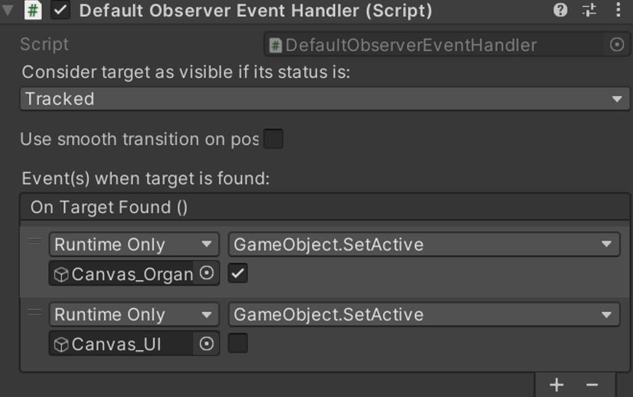
With Vuforia’s image targets’ default scripts, Default Observer Event Handler, the SerializeField of the script was fully engaged during the development of RecoAR. By tracking an image target, a specific event of scripts from other game objects would be triggered, such as activating an UI canvas when the target is found. It became such a time saver in development without pulling extra scripts to enhance the interaction experience of the app.
Boolean
Boolean was one of the most used techniques in the app’s development. For example, when an organic waste bin’s image target was found, the void ‘scannedOrganic’ in the script CheckRubbish.cs would be triggered. And the Boolean ‘hasOrganic’ in the void would be converted to a ‘true’ statement. Then further interactions and functions in the app experience would judge based on the Boolean status.
Image Targets
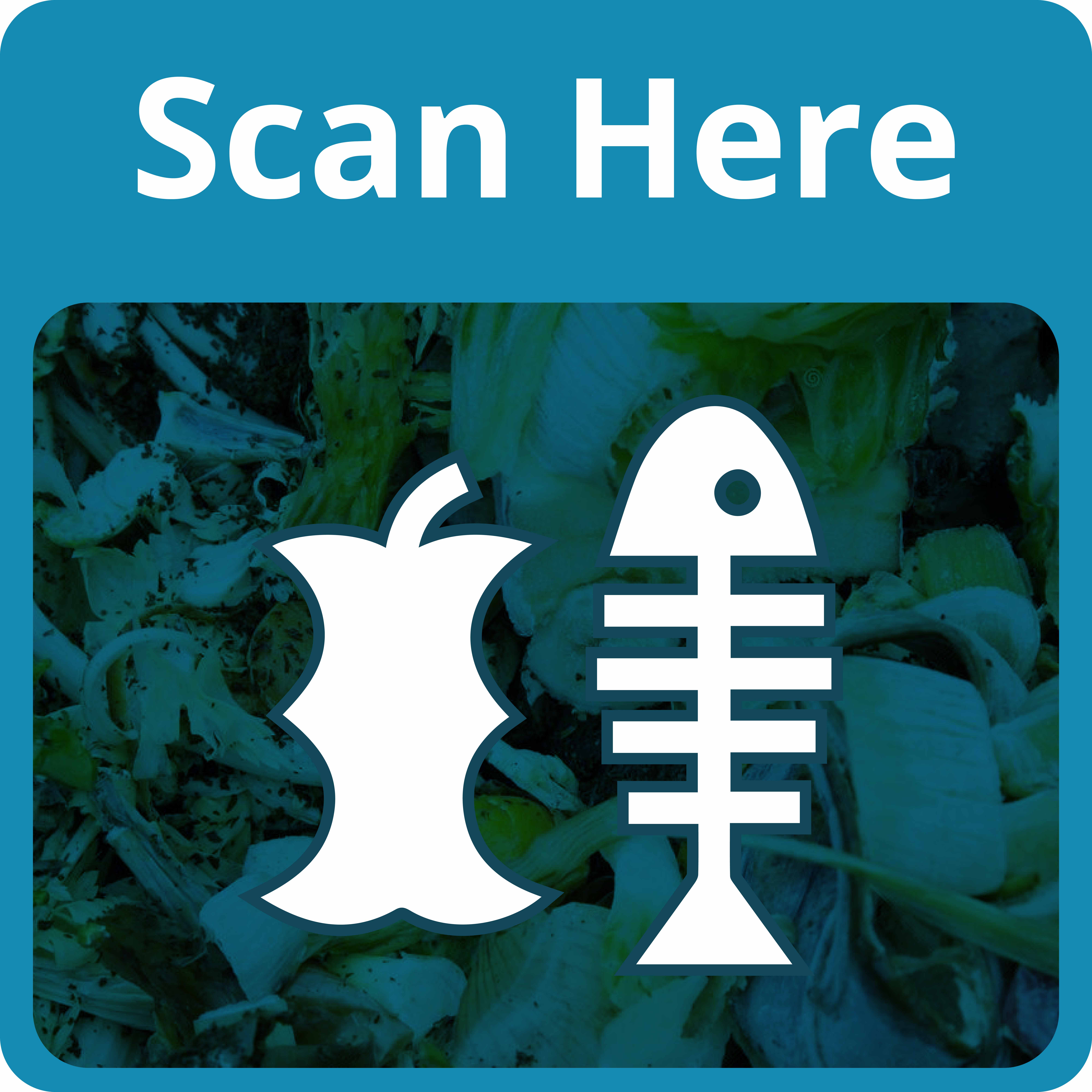
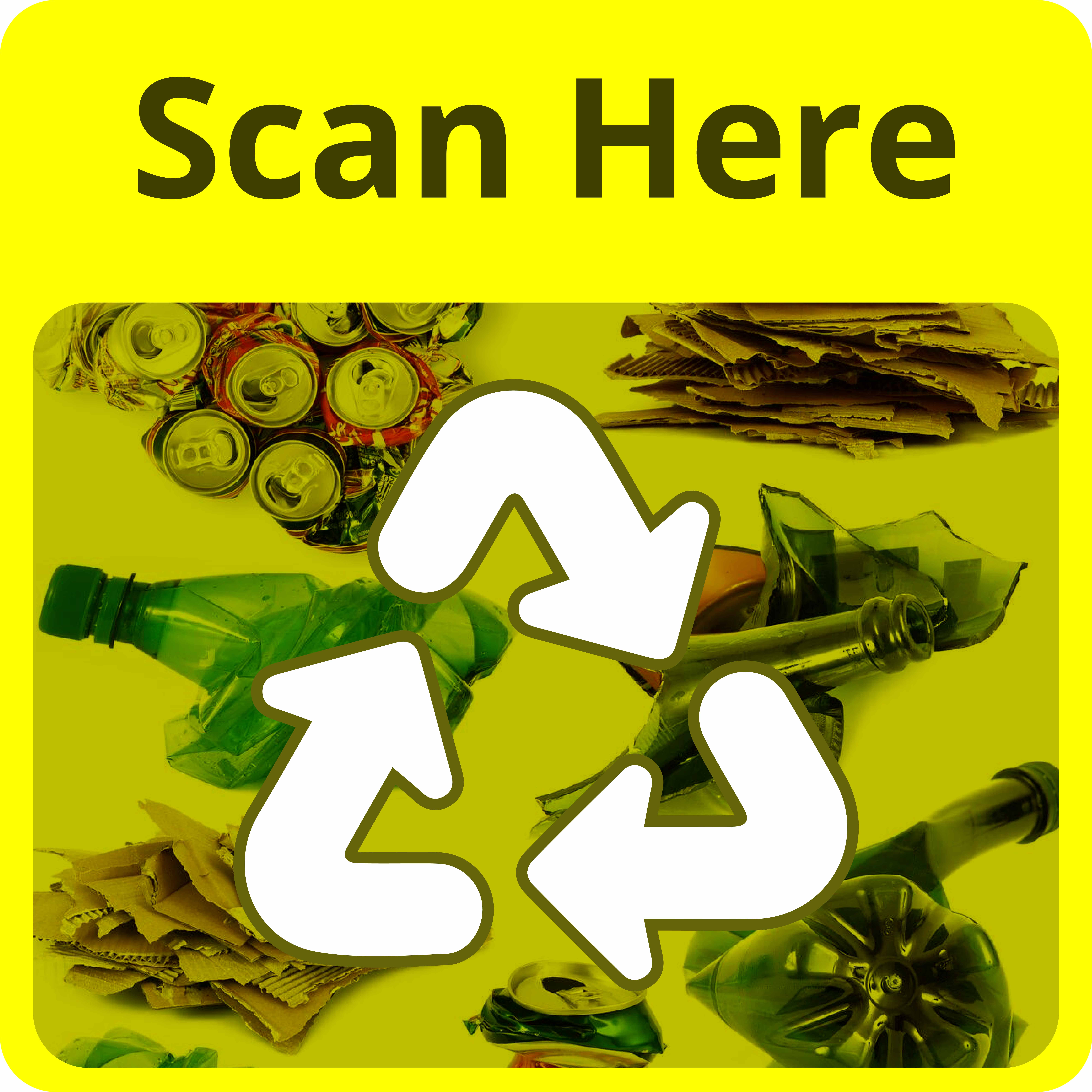
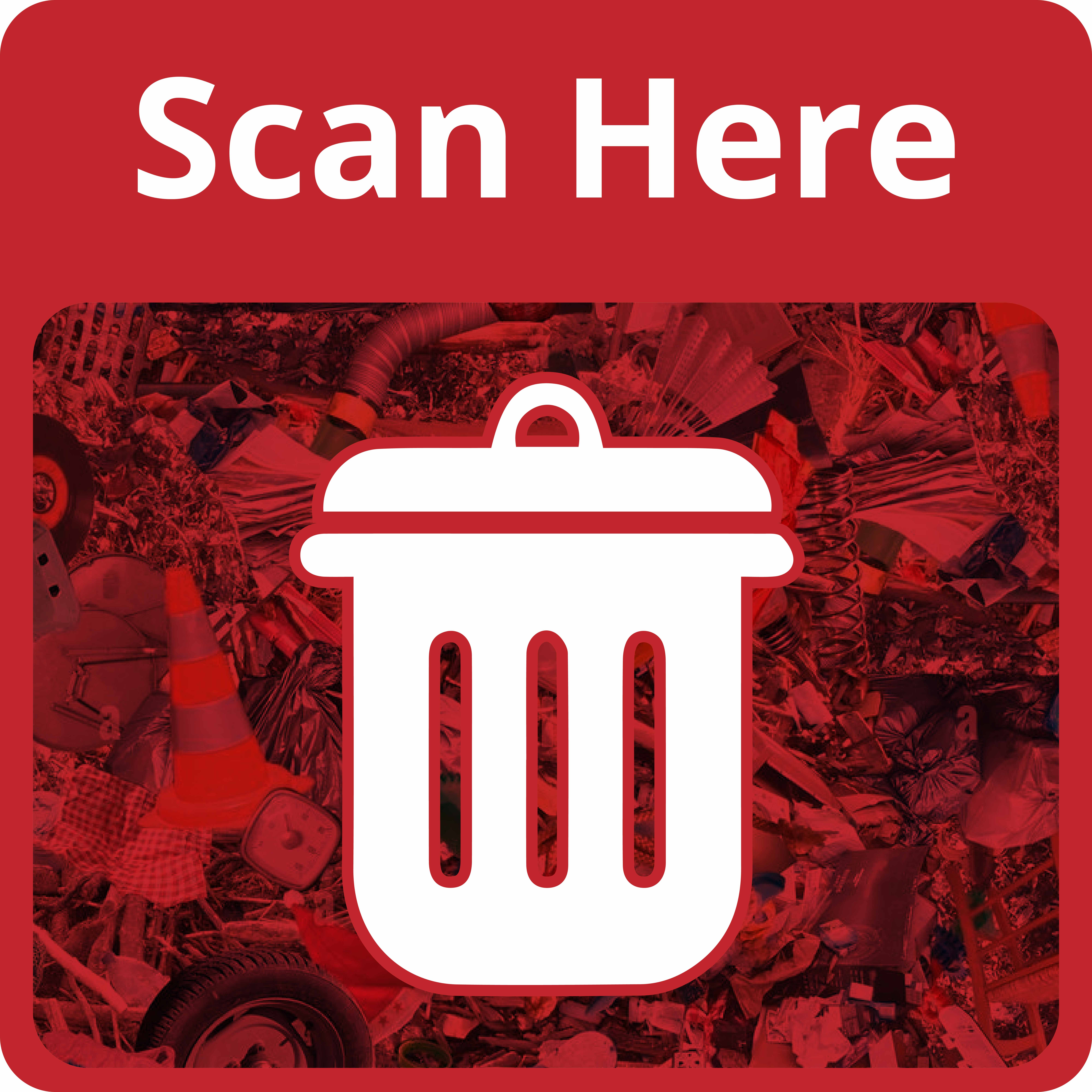
Set A (Bins)
| 
| 
|
| Organic Waste | Recycling | General Waste |
Set B (Rubbish Types)
| 
| 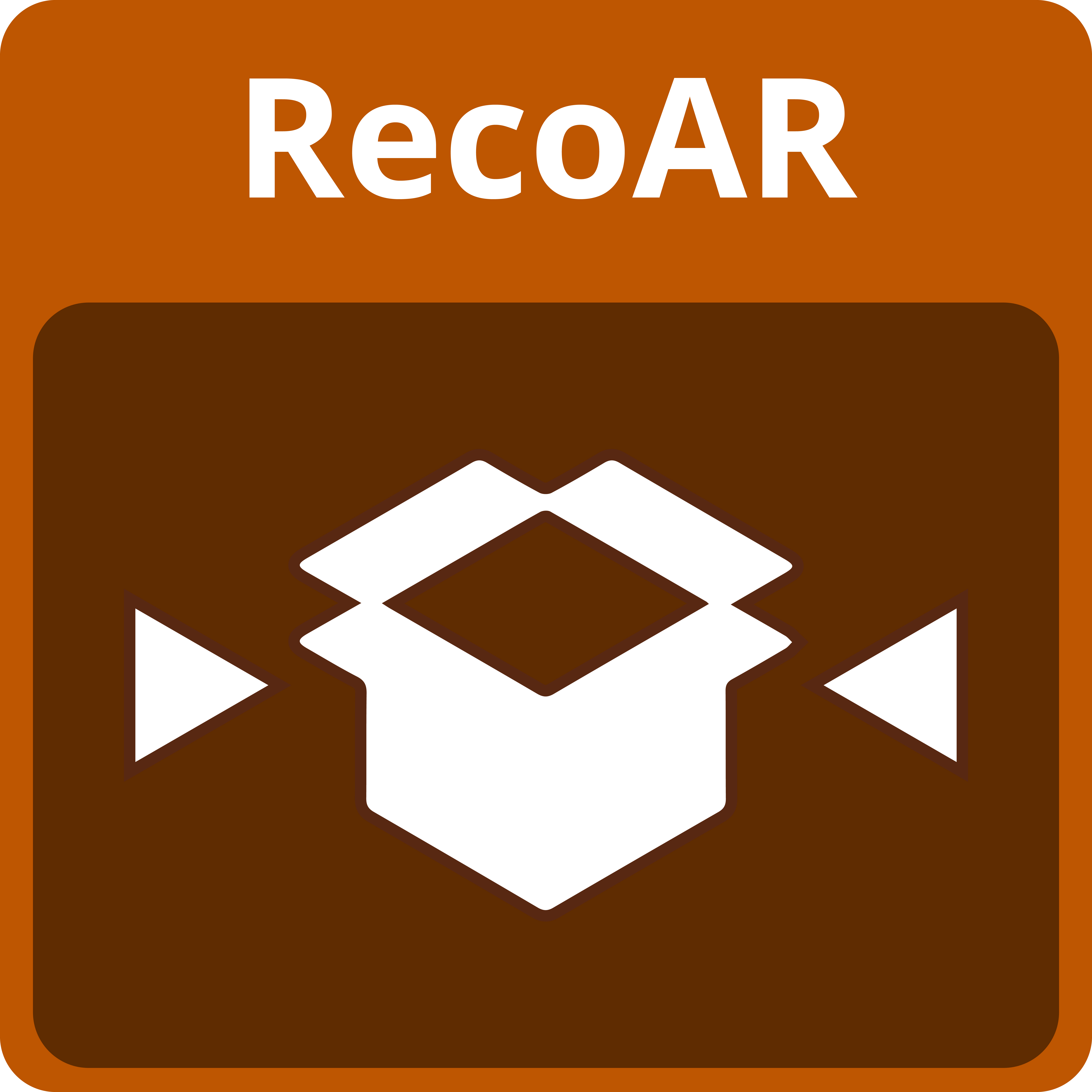 |
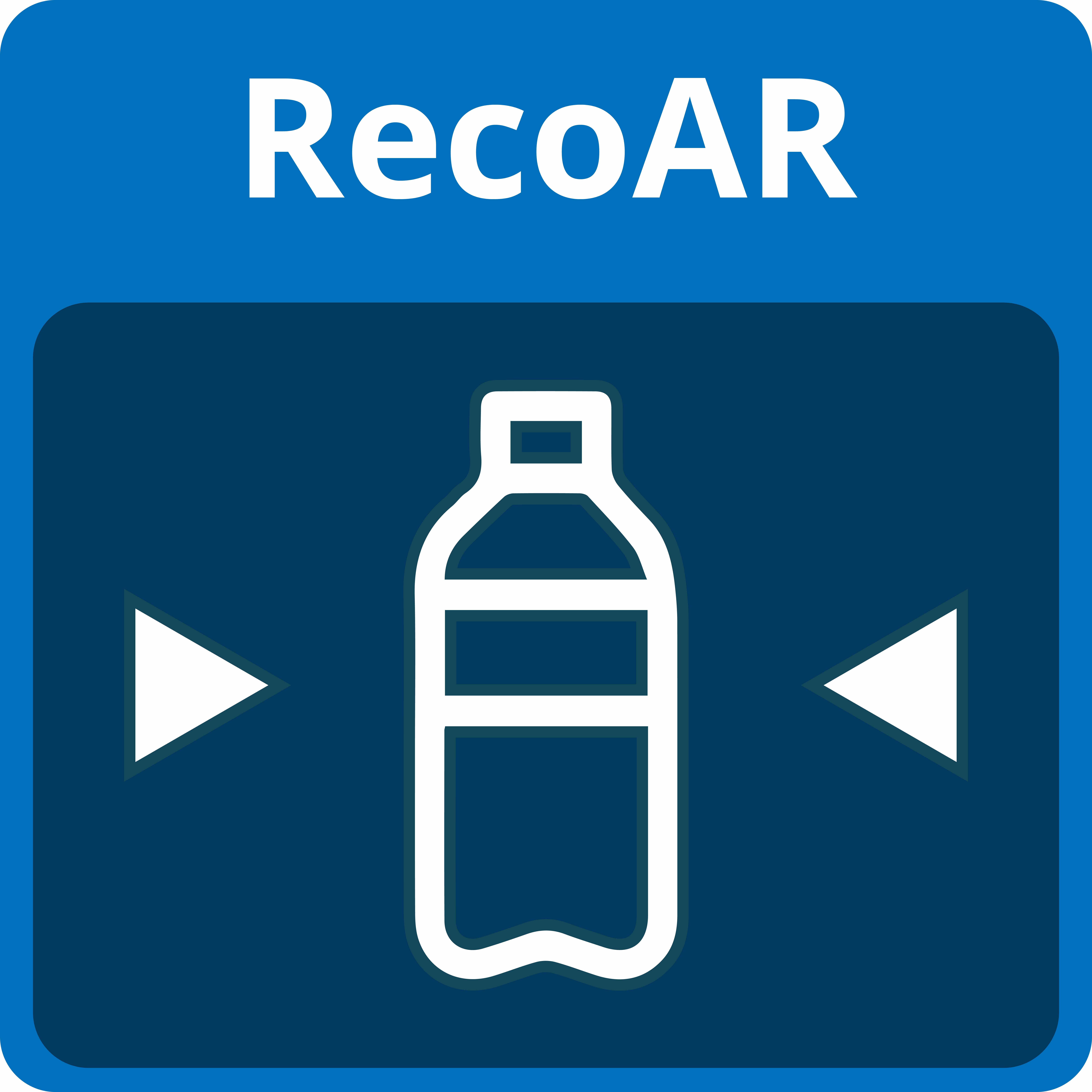
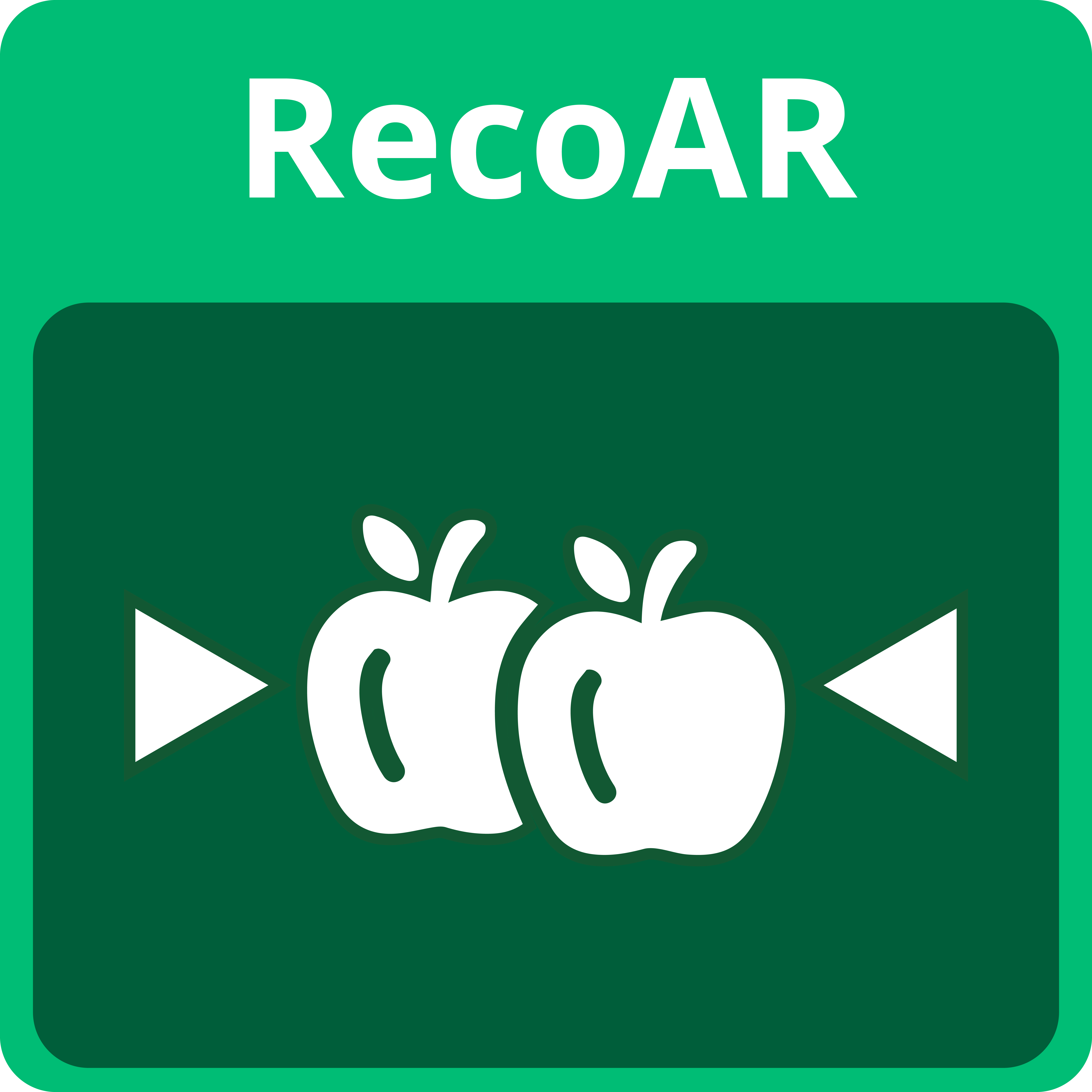
| Water Bottle Image Target | Fruits Image Target | Cardboard Image Target |
| To represent the conditionally recycling waste material | To represent the organic waste material | To represent the recycling waste material |
Engagement
The application uses Vuforia Engine’s Image Targeting Technology to select and display 3D models upon detecting a familiar image.
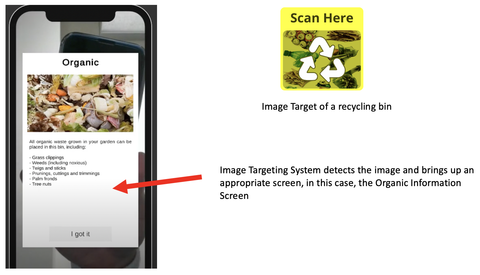
A target image from Set A produces a relevant information screen that the user can read to learn more about what the bin can take
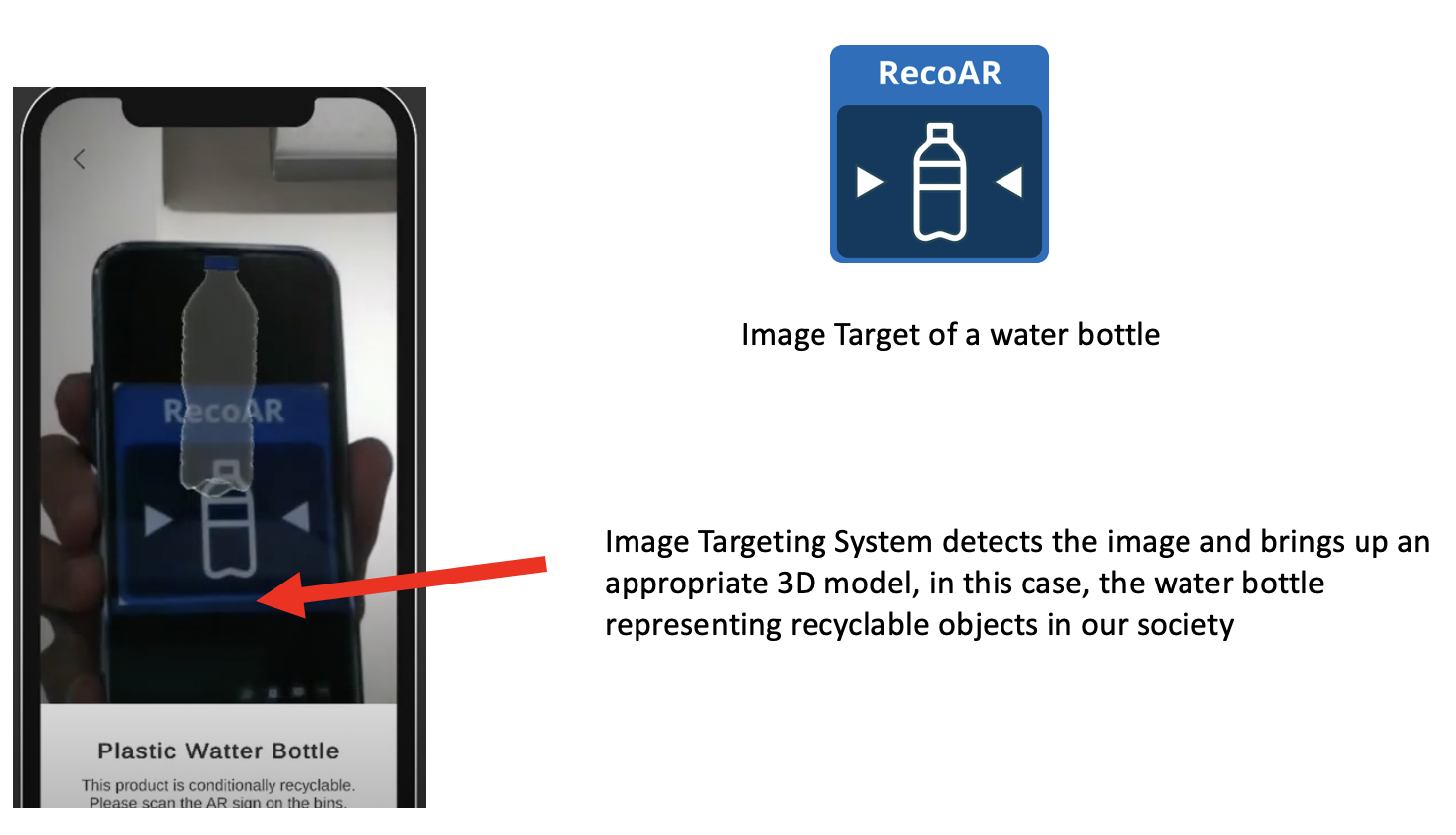
A target image from Set A produces a relevant information screen that the user can read to learn more about what the bin can take
Matching activity
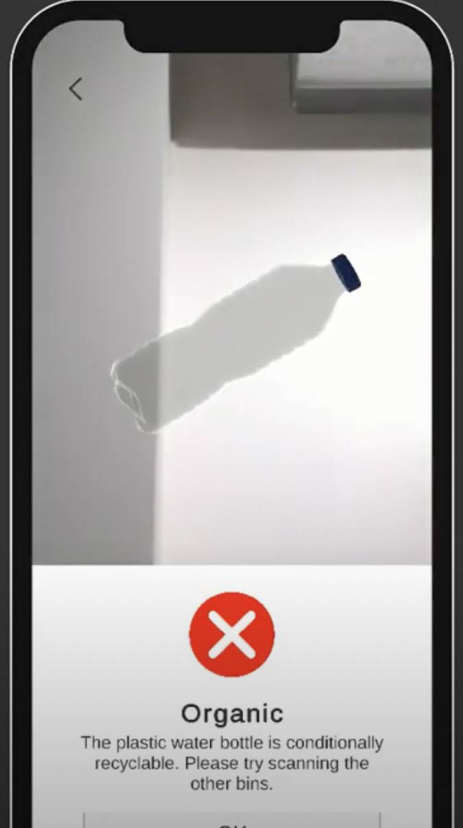
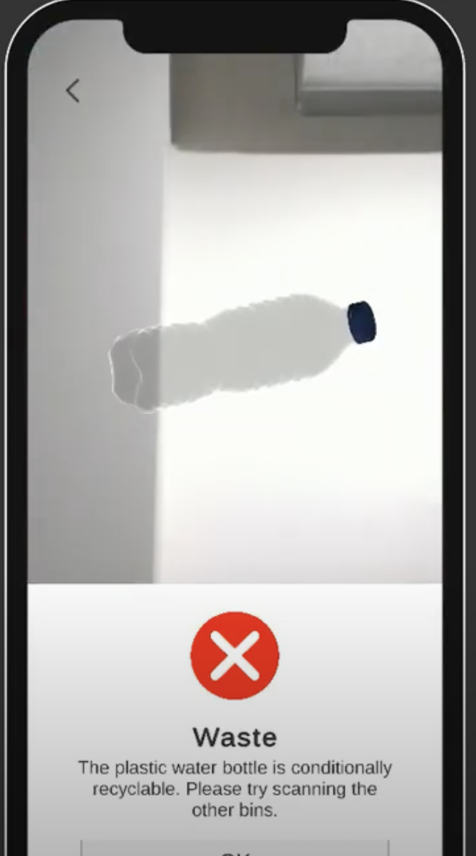
Under the same engine, it also utilises a matching sequence. This helps the user to match the rubbish with appropriate bins by scanning the image targets provided on the bins in order to verify if their answer is correct or not (as explained above in Interaction Design).
| 
| 
|
| Organic Bin via (Organic image target) rejecting the plastic bottle | Waste Bin via (Waste image target) rejecting the plastic bottle | Recycling Bin via (Recylcing image target) accepting the plastic bottle |
Descriptions of 3D Models
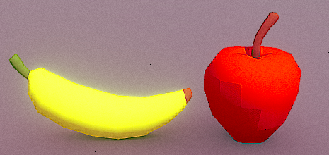
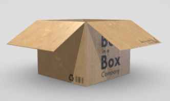
All 3D models were extracted from Sketchfab.
In summary, each model represents a relevant rubbish type for each bin (General waste, organic and recycling).
As of now, there is only one rubbish for each bin type.
|
|
|
Bottle | Fruits | Cardboard |
Usability Testing
Goals
In the usability testing and prototype evaluation of the RecoAR app, the following 3 objectives are expected to be achieved and to provide reliable data to support the update of the App prototype:
- To investigate the ease of use and obtain user feedback on the bin info retrieval required for identifying what the bin is about through a usability testing approach.
- Usability testing to investigate the ease of use of the garbage info retrieval required for identifying whether the garbage is recyclable.
It is predicted that every user participating in the test will be able to complete all tasks, with an average satisfaction rate of over 70% and less than 10% probability of bug reporting.
The following are some of the areas to look out for and tasks to be completed during usability testing:
- Identifying bugs and issues in the user experience: During the development of an app prototype, various levels of bugs and issues can arise during usability testing of the user experience. Usability testing provides developers with the opportunity to identify bugs in the prototype and provide effective feedback in a timely manner. User feedback on bugs and issues will be used as an important reference in future updates and development. If a large proportion of bugs and issues are misreported, the developer will need to rethink and redesign specific features and user experiences of the app.
- Identifying the target audience for usability testing of the app: The target audience needs to be clearly identified and targeted, i.e. the characteristics of the target audience need to be clearly defined. behavioural characteristics (app access habits, frequency of demand, length of use, etc.).
- Identifying confusing and ambiguous parts of the experience: As an app for acquiring basic information, it is important that the app has a clear and unambiguous user experience.
Methodology
Outreach & Screening
What we need to test is a mobile application to support the education of recycling instructions. In order to get as close as possible to the real user group that lacks basic recycling knowledge, we selected test users of different ages relatively young (below 25) and some from third-world countries to take part in our evaluation.
Channels Used:
The channels we used to connect with possible participants:
- Social media: Facebook, Whatsapp, Wechat, Instagram
- Classmates and Colleagues
Screening Criteria:
- Young people who grew up or are still living in third-world countries
- People who can use a smart mobile/device.
Participant Profiles
All test participants had poor knowledge in recycling and waste disposal and were proficient in the use of a mobile device. The age distribution of the participants in the test was 17-14 years.
Participant | Age | Gender | Country |
P1 | 18 | Male | Regional China |
P2 | 17 | Female | Myanmar |
P5 | 21 | Male | Laos |
P6 | 19 | Female | Thailand |
P7 | 19 | Male | Cambodia |
P8 | 22 | Female | Vietnam |
Tasks
Test participants were asked to complete the following tasks:
- Retrieve information from the Recycling, Organic and Waste bins using their respective image targets.
- Scan a plastic bottle and the bins to determine where it should go using image targets.
Task Testing
Testing Results
The tables below contain participants that have voiced not only similar but also additional feedback in comparison to the others. Respective ratings and durations to complete each task were also recorded.
Task 1: Retrieve information from the Recycling, Organic and Waste bins using their respective image targets.
Participant | Complete Time | Rating | Comments |
P1 | 20.12 secs | ★★★★☆ | The instant preview of the bin information board was nice. Instant feedback! |
P2 | 18.13 secs | ★★★★☆ | Very intuitive with the image targets. I can already predict what bin it would be before scanning. And when I got more information on it, it was satisfying. |
P3 | 24.17 secs | ★★★★☆ | As fast as it is, I wish there was more information on the bin or supplied with useful links for more research. |
P4 | 25.52 secs | ★★★☆☆ | I wish the text font was a little more interesting to read through. |
P5 | 23.21 secs | ★★★☆☆ | I think proper text formatting was needed so the reader could skim through important bits easier. |
P6 | 29.29 secs | ★★★☆☆ | There is a bug with the image banner. Some photos are cropped out weirdly. |
P7 | 22.27 secs | ★★★★☆ | Intuitive matching with the image targets. |
P8 | 21.43 secs | ★★★★☆ | While the instant feedback is nice, it would be more useful with short educational videos. |
Min: 18.13 secs
Max: 29.29 secs
Mean: 23.02 secs
Overall rating: 3.63/5 (72.6%)
Task 2: Scan a plastic bottle and the bins to determine where it should go using image targets.
Participant | Time | Rating | Comments |
P1 | 22.12 secs | ★★★★★ | The matching was already obvious from the get-go because the image targets were intuitive. The animation just made it more satisfying. |
P2 | 23.43 secs | ★★★★★ | Intuitive matching! |
P3 | 25.27 secs | ★★★★☆ | Did what it was supposed to! Some sound effects would have made it cooler! |
P4 | 22.11 secs | ★★★★★ | Great animation! Was a bit too slow imo. |
P5 | 25.13 secs | ★★★☆☆ | Worked like a charm. The 3D models needed better shaders imo. |
P6 | 26.17 secs | ★★★★☆ | Sound effects would have contributed to the animation. |
P7 | 15.29 secs | ★★★★☆ | I think I just got lucky matching with the first image target I had. Cool little animation! |
P8 | 17.43 secs | ★★★☆☆ | Fast, effortless matching. The animation was a bit too slow. |
Min: 15.29 secs
Max: 26.17 secs
Mean: 22.12 secs
Overall rating: 4.13/5 (82.6%)
Testing discussion
This discussion section summarises the comments made from Table 1, and 2. Participants appreciated the simplicity and straightforwardness of the app which aided in plentiful intuitiveness. However, the oversimplification led to some design oversights that led to a poor user experience.
TASK 1 Summary
- The image targets were properly backed with relevant images in the backdrop, providing affordance.
- Better text formatting is needed to make reading easier.
- External information links were recommended if the user wanted to read more.
- Short educational videos were suggested for each bin.
- BUG: Image banners are improperly cropped.
TASK 2 Summary
- The custom animation was widely appreciated but was animated too slow.
- Sound effects were suggested to provide more feedback.
100% | 77.6% | 0% |
of participants successfully completed all tasks related to the overall concept of the product. | overall satisfaction was achieved using the product. | of participants had trouble using this product. |
The Good | The Bad |
"Very simple and straightforward to use." | "Very lacklustre in terms of aesthetics. Nothing more than a scanner app without any advanced functionalities." |
Recommendations
After the usability test, the eight users who participated in the test made various comments. After the feedback had been collated and analysed, the following recommendations were made in order to better optimise the user experience, which could be a useful reference for future optimisation updates of prototype:
- After conducting 2 tasks of usability testing, an average satisfaction level of 77.6% was obtained, which is slightly higher than the expected 70%. This report recommends that the development team should focus on optimising the UI design (colour palette, button size, text layout, etc.), animation pacing and sound elements where most of the negative user feedback is received.
- One notable bug reported by one of the users was the image banner getting improportionately cropped hurting the overall look of the app which should be addressed immediately.
- The responsiveness and animations were the elements of the prototype that received the most positive feedback from users in the usability testing. The responsiveness helps to quickly navigate different items and read relevant information about them. However, there was also feedback that the animation was too slow and could affect the efficiency of the flow of the app. This report suggests that developers can retain the functionality and basic user interface design, but can make incremental adjustments.
Addressing the Results of the Usability Testing
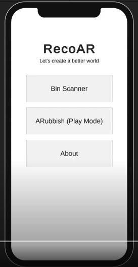
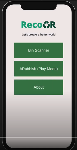
Revamped UI and graphics
Improved UI with a new design | ||
| TURNS INTO |
|
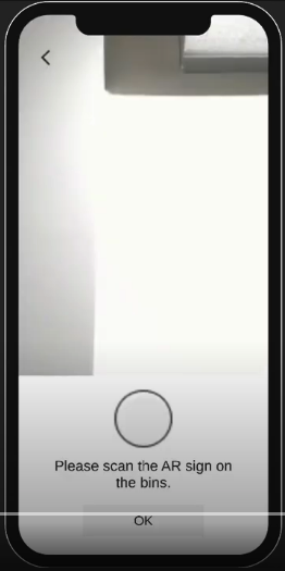
| More visibility (Color highlighting) | ||
 | TURNS INTO | 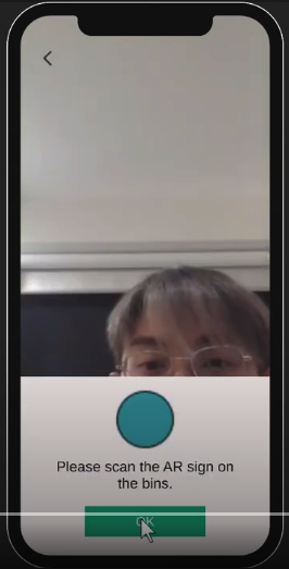 |
| Improved graphics (Better shaders) | ||
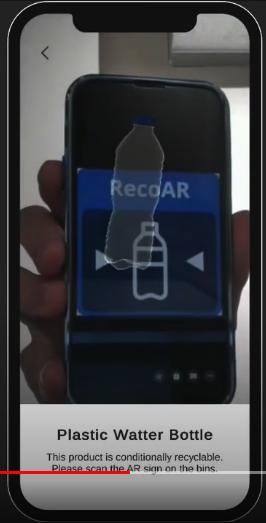 | TURNS INTO | 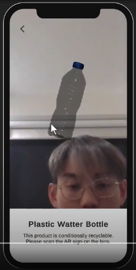 |
References
Fruits: https://sketchfab.com/3d-models/low-poly-fruits-b6d1b506c687424187c87ab913a210ba
Cardboard: https://sketchfab.com/3d-models/cardboard-box-f43199f19c3142c68cc672db55d9a40d
Bottle: https://sketchfab.com/3d-models/plastic-water-bottle-fdc859edc8274342ba00a47f84c148d9
KIT 724 - Assignment 5 Report
| Status | Prototype |
| Category | Other |
| Author | phonepyaetun |
Leave a comment
Log in with itch.io to leave a comment.